AI product photography prompts are structured instructions that tell an image model how to preserve a real product while changing the scene, camera angle, lighting, styling and environment. The best prompts lock the packaging first, then define composition, materials, lighting, texture, camera behaviour and what must not be changed.
Creating an AI product image is easy. Creating one that actually feels like a brand campaign is harder. The difference usually comes from the thinking behind the prompt: what the camera is doing, where the product sits, how the light behaves, which textures need to stay imperfect, and which parts of the real packaging must never change.
This prompt pack gives you six reusable product-photography concepts. Each one is designed so you can upload your own product reference, replace the placeholder, and keep the core visual identity of the pack while changing the environment around it.
The most important rule across every prompt is product fidelity. Treat your uploaded product as the source of truth. The model should preserve the container shape, cap, label, logo, colours, proportions, finish and readable pack details rather than inventing a new design.
How to Use These Prompts
- Upload a clean product reference image, ideally front-facing and high resolution.
- Replace [MY PRODUCT] or [MY PRODUCT VARIANTS] with the product you want the model to use.
- Keep the PRODUCT — CRITICAL section intact. This is the lock that protects packaging consistency.
- Change ingredients, colours or setting details only when they make sense for your brand.
- Generate the visual without added poster text. Add your campaign headline later in Canva, Photoshop or your design workflow for better typography control.
Consistency tip: If your product keeps changing between generations, use the same clean product reference every time and repeat the packaging lock word-for-word across the series.
1. Rustic Ingredient Crate Hero Shot
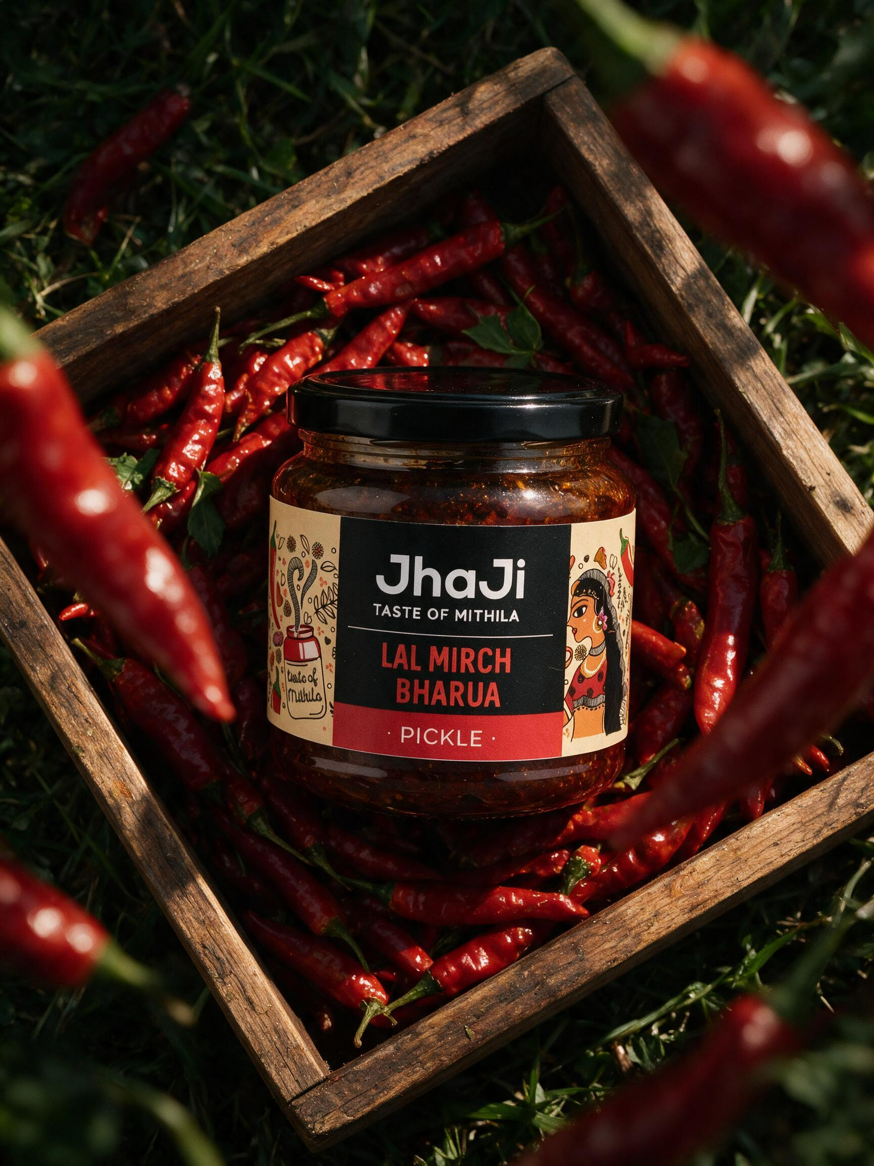
This setup turns the product into the centre of an ingredient story. The rustic crate, dense produce and foreground blur create depth while the top-down framing keeps the pack easy to recognise.
Best for: Sauces, pickles, chutneys, condiments, spices, jams and ingredient-led food brands.
COPY-AND-PASTE PROMPT
Create a premium photorealistic advertising photograph in vertical 3:4 aspect ratio, using my uploaded product as the exact product reference.
PRODUCT — CRITICAL: Replace the jar in the reference composition with [MY PRODUCT]. Preserve the exact real-world packaging, container shape, dimensions, cap/lid, materials, colours, logo, label layout, proportions, surface finish and product details from my uploaded reference. Do not redesign, stylize, distort, recolor or invent packaging elements. The product should look naturally photographed, not CGI.
COMPOSITION: Extreme top-down / flat-lay camera angle. Place the product prominently in the center of a rectangular rustic wooden crate or tray, occupying roughly 45–55% of the frame height. Rotate it very slightly for a casual premium editorial feel rather than placing it perfectly mechanically straight.
Fill the wooden crate densely with fresh ingredients visually related to the product. For a spicy or chilli product, use dozens of realistic fresh glossy red chillies underneath and surrounding the package. If my product has a different key ingredient, intelligently replace the chillies with that ingredient while keeping the same dense, abundant composition.
The wooden tray has thick, aged natural timber borders with visible grain, scratches, imperfections and warm brown tones. The tray sits directly on a bed of dark green natural grass, herbs or rough organic foliage, creating a rich farm-to-table environment.
Add several large foreground ingredients very close to the camera lens, entering partially from the left, right, top-right and bottom edges. These foreground objects must be heavily out of focus with natural optical bokeh, creating strong depth and framing the centered product. Background ingredients inside the crate remain mostly sharp.
LIGHTING: Dramatic cinematic natural sunlight coming diagonally from the upper-left or side. Strong warm highlights across the product, wooden frame and ingredients, with deep dimensional shadows between the ingredients. Rich contrast but retain realistic shadow detail. Subtle reflected highlights on glass, metal or glossy packaging according to the actual product material.
TEXTURES: Extremely realistic ingredient texture — natural wrinkles, irregular shapes, stems, tiny imperfections, moisture sheen and colour variation. Rough tactile wood grain, individual grass blades, tiny dust particles and believable organic imperfections. Product material should show physically accurate reflections, refraction and micro-texture.
CAMERA LOOK: Premium commercial food photography, 50–70mm equivalent macro/editorial lens character, shallow foreground depth of field while keeping the product and central ingredients crisp, subtle vignette, natural lens falloff, rich blacks, warm highlights, deep earthy greens and intense ingredient colours.
Sophisticated artisanal food-brand campaign aesthetic, premium heritage feeling, dramatic yet natural, high-end magazine advertising photography, photorealistic, ultra-detailed, realistic optics, 8K detail.
IMPORTANT: no headline, no advertising copy, no typography, no badges, no floating labels, no captions, no graphic elements, no decorative lettering, no watermark and no additional logo. Only retain text/logo that physically exists on my uploaded product packaging.
2. Hands Holding Products in a Warm Artisan Store
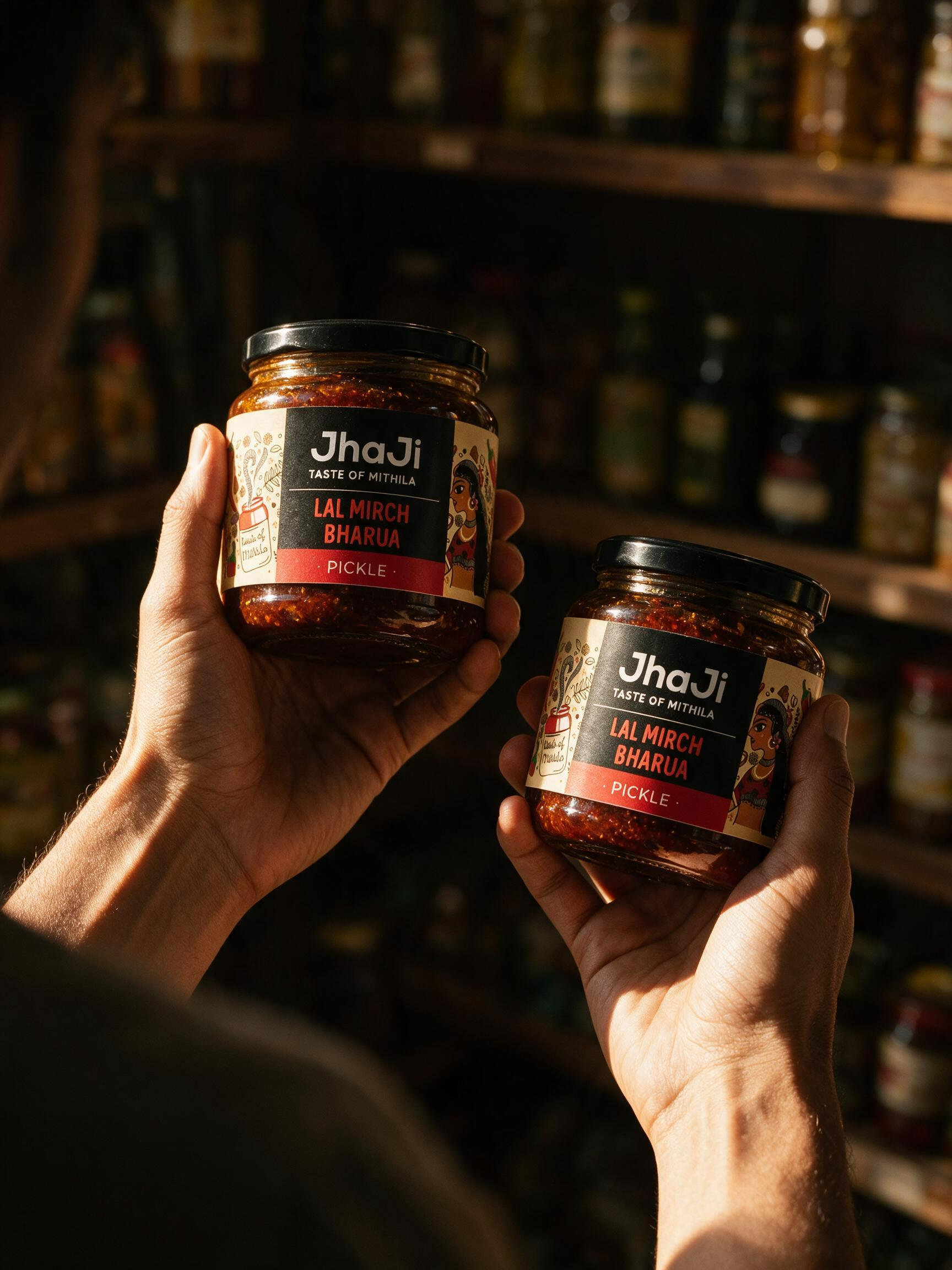
A product instantly feels more believable when it is held naturally. This shot uses warm directional light, real skin texture and a softly blurred retail environment to create a candid premium moment.
Best for: Sauces, beverages, condiments, wellness bottles, skincare and products that benefit from a human-scale lifestyle shot.
COPY-AND-PASTE PROMPT
Create a premium photorealistic lifestyle product photograph in vertical 4:5 composition, matching the visual language of the reference image.
PRODUCT — CRITICAL: Replace both products in the scene with [MY PRODUCT / MY TWO PRODUCTS], using the uploaded product image as the exact visual reference. Preserve the original packaging exactly: bottle/jar shape, dimensions, cap, glass/plastic material, transparency, liquid/product colour, label, logo, typography, graphics, proportions and surface finish. Do not redesign, simplify, recolor or invent packaging details.
SCENE: Close over-the-shoulder photograph of a person standing inside a warm, dimly lit artisan grocery store, speciality food shop or pantry-style retail environment. Only the person’s shoulders, forearms and hands are visible; face completely outside the frame.
The left hand holds the larger product slightly higher and farther from the camera, angled naturally toward the lens so the front label remains clearly visible. The right hand holds the smaller product slightly lower and closer to the camera. Both products are presented casually as if the shopper is comparing or inspecting them.
Hands should wrap naturally around the packaging without covering the important front label areas.
HANDS & SKIN — IMPORTANT: extremely realistic human anatomy, five fingers per hand, anatomically correct grip, realistic knuckles, tendons, finger joints and nail shapes. Natural warm skin tone with visible pores, tiny hairs, subtle wrinkles, fine lines, slight tonal variation, realistic veins and micro-texture. No waxy, plastic or overly smooth skin.
BACKGROUND: dark wooden retail shelves filled with softly recognizable jars, bottles and pantry products. Keep all background packaging heavily blurred and unreadable. Warm brown wood, muted amber, dark olive and deep shadow tones. The environment should feel authentic, intimate, handcrafted and premium rather than like a clean studio.
LIGHTING: strong directional golden sunlight entering from the upper-left or side, creating dramatic patches of warm illumination across the hands and products. Bright specular highlights on the packaging with deep cinematic shadows around the edges. Realistic light transmission through transparent glass or liquids where applicable. The products should be the brightest and most attention-grabbing elements of the photograph.
CAMERA: intimate documentary-style commercial photography, approximately 50mm equivalent lens, f/1.8–f/2.8, shallow depth of field, sharp focus on both products and hands, creamy background bokeh, subtle foreground shoulder blur at the bottom-left, natural perspective, realistic optical falloff.
COLOR GRADE: rich warm amber highlights, dark chocolate-brown shadows, subtle red/orange accents, cinematic contrast, slightly moody exposure, premium artisanal food-brand photography.
Natural candid framing, imperfect real-world composition, high-end editorial campaign photography, authentic reflections, realistic glass and liquid physics, fine material texture, photorealistic 8K detail.
NO EXTRA TEXT: no headlines, captions, callouts, badges, graphic overlays, floating typography, watermarks or added logos. Only retain the text and branding physically printed on my actual product packaging.
3. Grocery Basket Product Discovery Shot
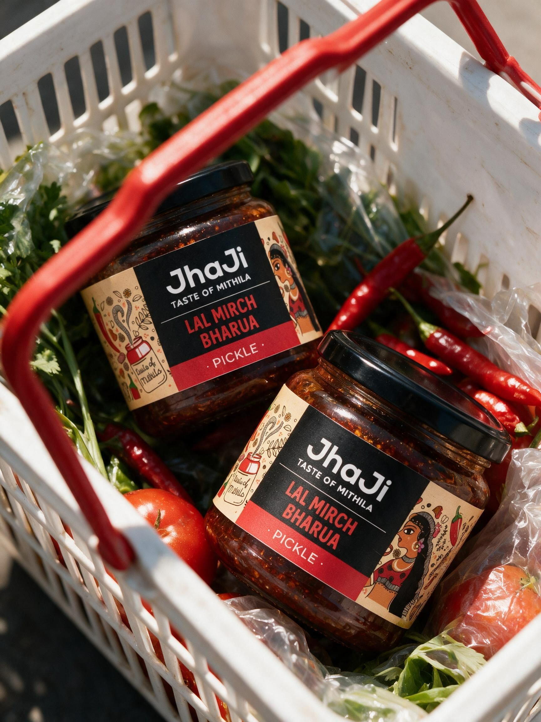
This composition makes the product feel discovered rather than staged. The basket handle acts as a bold foreground graphic while fresh produce adds colour and category context.
Best for: Retail-ready food products, pasta sauces, condiments, beverages, packaged snacks and modern FMCG brands.
COPY-AND-PASTE PROMPT
Create a premium photorealistic grocery-shopping product photograph inspired by the reference composition, vertical 4:5 aspect ratio.
PRODUCT — CRITICAL: Replace the two jars in the reference with [MY PRODUCT / MY PRODUCT VARIANTS] using my uploaded product images as the exact visual reference. Preserve the real packaging exactly: container shape, jar/bottle proportions, cap/lid, material, transparency, product colour, label placement, logo, typography, graphics, print finish and all physical details. Do not redesign, simplify, recolor, distort or invent packaging.
COMPOSITION: Camera looking downward into a white plastic grocery basket with a bright red metal/plastic handle cutting diagonally through the foreground.
Place two units of my product inside the basket, arranged diagonally and slightly overlapping. First product positioned toward the upper-left, tilted approximately 20–30 degrees. Second product positioned toward the lower-right, slightly closer to camera. Both front labels face upward and remain clearly visible. Products should feel casually placed rather than perfectly arranged.
The basket should be partially filled with fresh ingredients related to my product. Use vegetables, fruits, herbs, chillies, tomatoes, greens or other ingredients that naturally connect with the product category. Some ingredients may sit inside transparent grocery bags to create realistic supermarket-shopping context.
FOREGROUND DEPTH: the red basket handle should pass very close to the camera and partially cross in front of the products, creating strong dimensional layering. Keep portions of the handle slightly out of focus while the products remain sharp.
BACKGROUND: tightly cropped grocery basket environment only, filled with natural produce and subtle packaging shapes. No visible store signage. Keep secondary objects slightly softer so attention remains on the products.
LIGHTING: bright direct natural sunlight hitting the products from the upper-left, creating strong crisp highlights and graphic shadows across the labels, basket and ingredients. Realistic reflections on glass/plastic packaging and accurate transparency where applicable.
CAMERA STYLE: premium editorial supermarket campaign photography, close-up top-down angle, approximately 35–50mm equivalent lens, shallow-to-medium depth of field, sharp product labels, subtle foreground blur, natural perspective and slight handheld imperfection.
COLOR FEEL: fresh, vibrant, modern and energetic. Clean whites, saturated ingredient colours, bright red basket accents and warm natural sunlight. Maintain the actual colours of my product without altering them.
REALISM: realistic grocery basket scratches and imperfections, crinkled plastic produce bags, natural fruit and vegetable textures, irregular shapes, tiny blemishes, moisture, realistic glass reflections and physically accurate shadows. Avoid overly polished CGI surfaces.
Premium modern food-brand campaign, candid supermarket aesthetic, youthful editorial advertising photography, photorealistic, ultra-detailed, natural optics, 8K.
NO EXTRA TEXT: no headline, no caption, no promotional copy, no badges, no floating labels, no graphical typography, no watermark and no additional logos. Only preserve text and branding physically printed on my actual product packaging.
4. Minimal Floating Product Stack
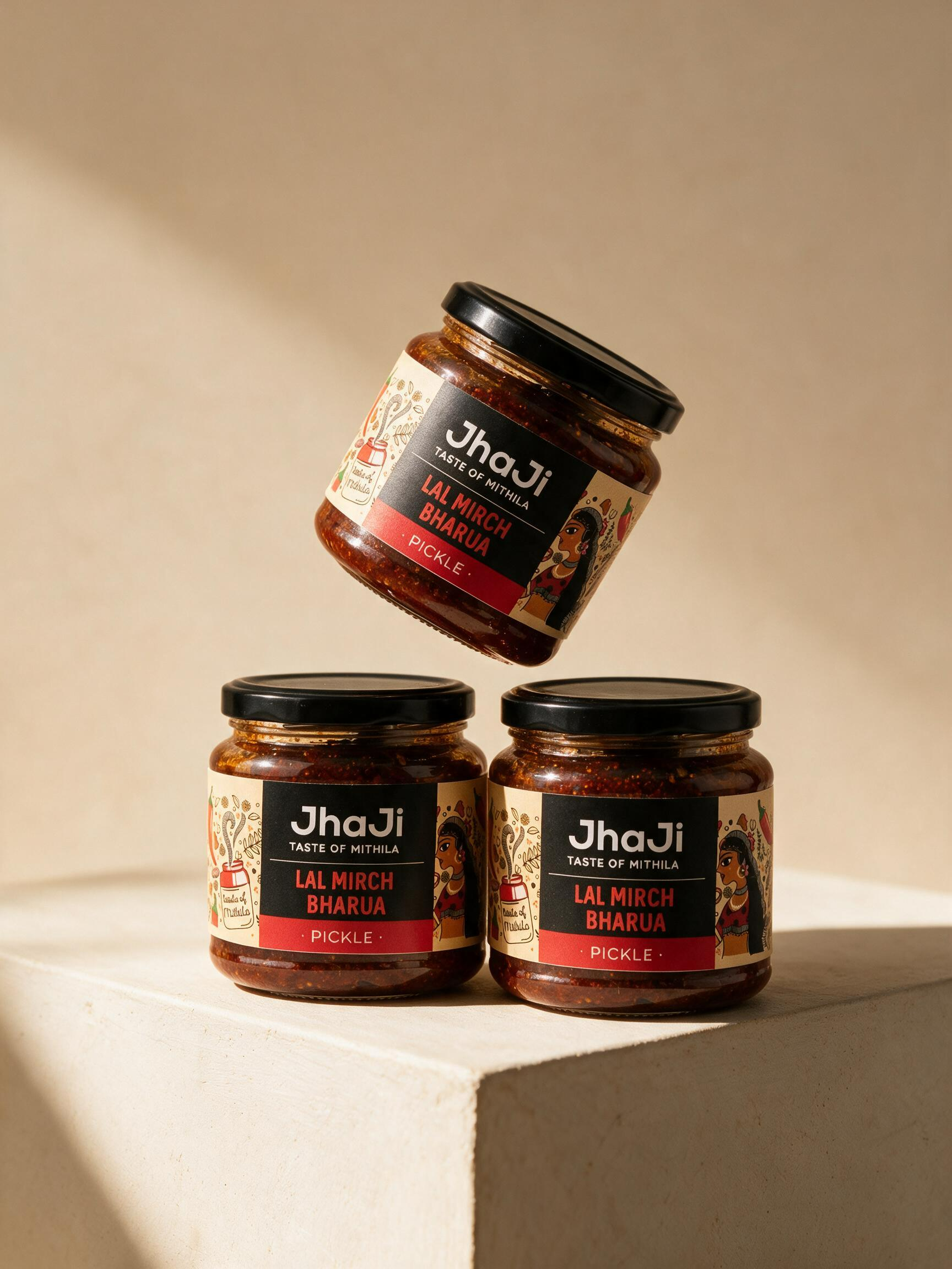
When you need a clean campaign hero image, this floating stack gives you a strong visual without extra props. It is ideal for presenting multiple variants while retaining plenty of negative space.
Best for: Product ranges, flavour variants, skincare, supplements, jars, candles and premium DTC launches.
COPY-AND-PASTE PROMPT
Create a premium photorealistic studio product photograph in vertical 4:5 aspect ratio, recreating the clean stacked-product composition of the reference image.
PRODUCT — CRITICAL: Replace every jar in the reference with [MY PRODUCT / MY PRODUCT VARIANTS] using my uploaded product images as the exact visual reference. Preserve the packaging exactly: container shape, dimensions, cap/lid design, glass/plastic material, transparency, product colour, label size and placement, logo, typography, graphics, proportions and surface finish. Do not redesign, recolor, simplify, stretch or invent packaging details.
COMPOSITION: Arrange three units of my product as a sculptural product tower.
Two products sit upright next to each other on the lower level, placed on top of a large minimal geometric pedestal. The jars slightly touch or sit very close together, but each front label remains clearly visible.
A third product is positioned above them, appearing suspended/floating diagonally in mid-air, rotated approximately 25–35 degrees. Its lower edge almost touches the products underneath, creating a playful gravity-defying balancing effect. The floating product should feel physically believable and naturally weighted, not randomly rotated.
Keep the overall product cluster positioned in the lower-middle portion of the frame, leaving generous clean negative space above.
PEDESTAL: large off-white / warm ivory geometric block with sharp architectural edges, matte plaster texture, subtle handmade imperfections and extremely fine surface grain. The pedestal enters from the bottom of the frame and creates an elegant corner or step underneath the products.
BACKGROUND: seamless warm beige, sand, cream or very light caramel studio background with a subtle tonal gradient. Completely minimal environment with no additional props, ingredients or decorations.
LIGHTING: soft directional studio sunlight from the upper-left, producing warm highlights across the packaging and subtle soft-edged shadows to the lower-right. Elegant specular reflections on glass or glossy materials while retaining the real surface finish of my product. Create realistic transparency, refraction and internal product visibility if the original packaging uses clear glass.
CAMERA: slightly low-to-eye-level commercial product angle, approximately 70–85mm equivalent lens for natural compression and premium proportions. Entire product arrangement sharp and detailed, minimal perspective distortion, controlled depth of field.
REALISM: physically accurate glass thickness, realistic lids, fine label paper texture, natural reflections, tiny manufacturing imperfections, realistic internal product texture and believable contact shadows between the lower products and pedestal.
COLOR GRADE: warm neutral beige palette, creamy highlights, subtle brown shadows, sophisticated premium food/skincare/lifestyle advertising aesthetic. Preserve all actual brand colours exactly.
High-end editorial packaging photography, minimal luxury campaign, contemporary DTC brand aesthetic, photorealistic, ultra-detailed, realistic materials, clean commercial lighting, 8K detail.
IMPORTANT — NO EXTRA TEXT: no headline, captions, taglines, badges, floating graphics, promotional copy, watermark or added typography anywhere in the scene. Only retain the logo and text that physically exists on my actual product packaging.
5. Cinematic Indian Lifestyle Portrait Holding the Product
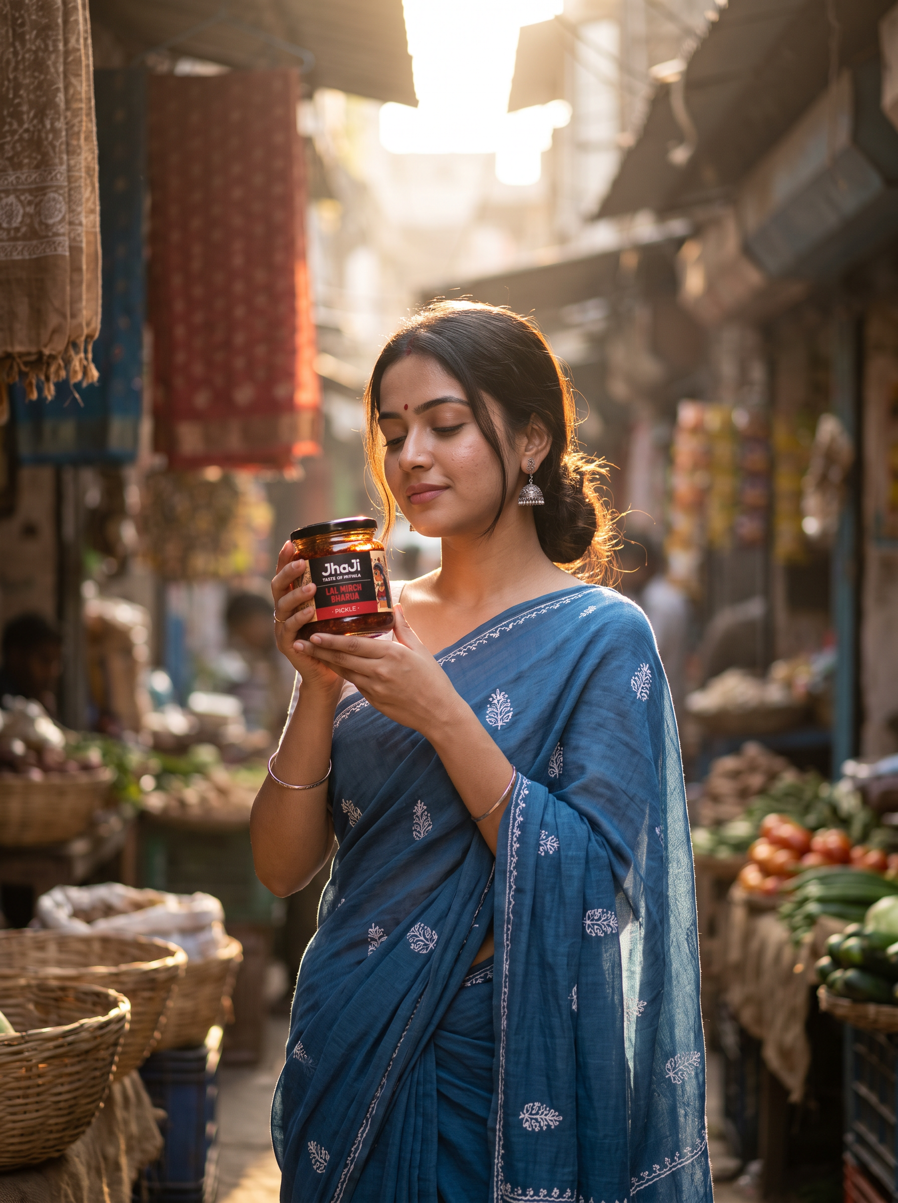
This prompt combines a product shot with a cinematic portrait. The key is to keep the human details natural: real skin, believable hands, soft expression and product integration that feels like a moment rather than a hard sell.
Best for: Heritage foods, beauty, jewellery, wellness, artisanal products and brands that need a culturally rich human story.
COPY-AND-PASTE PROMPT
Create a cinematic photorealistic lifestyle portrait in vertical 4:5 composition, inspired by the mood and framing of the reference image.
SCENE: A young Indian woman stands in a narrow old-market lane, softly backlit by warm natural sunlight streaming from behind and slightly above. The environment feels authentic, crowded and atmospheric, with hanging fabrics, baskets, stalls, vegetables and blurred marketplace details in the background. The alley should have rich depth, dreamy bokeh and a naturally busy but elegant visual storytelling feel.
MODEL: A beautiful young Indian woman in her mid-20s, slim build, graceful posture, soft feminine features and a calm expressive face. She has an oval face, natural medium-fair Indian skin tone with realistic tonal variation, soft cheek structure, natural nose shape, almond-shaped dark eyes, natural brows and naturally shaped lips with subtle lip texture. She wears a small red bindi on her forehead, silver jhumka earrings and minimal bangles. Her hair is dark brown to black, center-parted, tied loosely back with a few soft strands falling naturally around the face.
SKIN TEXTURE — VERY IMPORTANT: ultra-realistic skin with visible pores, natural micro-texture, tiny facial hairs/peach fuzz, slight under-eye texture, subtle uneven tone, soft natural highlights, realistic neck texture, faint blemishes or natural marks and non-airbrushed beauty. Avoid plastic, over-smoothed, porcelain or artificial skin. Keep the skin believable and human.
WARDROBE: She is wearing a soft elegant blue saree with subtle white embroidered or woven motifs, draped naturally and realistically. The fabric should feel lightweight, breathable and slightly translucent in places where light hits it. The saree should look graceful and authentic, not overly stylized.
ACTION: Instead of flowers, she is gently holding my product/products in both hands close to her chest and slightly lifted toward the light, as if admiring or presenting them naturally. The products should feel integrated into the moment, not like a stiff ad pose. Her expression is soft, serene and slightly dreamy, with eyes gently closed or half-closed, enjoying the light and mood.
PRODUCT — CRITICAL: Replace the flowers with [MY PRODUCT / MY PRODUCTS] using my uploaded product image as the exact packaging reference. Preserve the real product exactly: shape, proportions, cap/lid, material, label, logo, colours, finish and text printed on the packaging. Do not redesign the packaging. Keep the branding readable but natural.
COMPOSITION: Mid-length portrait framing, model placed near the center, body slightly turned to the side. Products clearly visible in her hands. Strong depth of field with blurred foreground market elements at the bottom and edges for a cinematic layered composition.
LIGHTING: Warm golden backlight with soft rim light around her hair and shoulders, mixed with gentle ambient shadow from the market alley. The lighting should create a dreamy, emotional, premium editorial look.
CAMERA STYLE: Shot like high-end lifestyle editorial photography, 85mm lens feel, shallow depth of field, creamy bokeh, realistic lens falloff, natural perspective, soft cinematic contrast.
MOOD: poetic, nostalgic, elegant, emotional, culturally rich, premium lifestyle campaign.
REALISM: realistic hands and fingers, realistic saree folds, natural anatomy, believable product grip, authentic market textures, cinematic but grounded.
IMPORTANT: no extra text, no poster typography, no graphic overlays, no watermark. Only keep the branding that already exists on my actual product packaging.
6. Botanical Product Resting Between Tree Branches
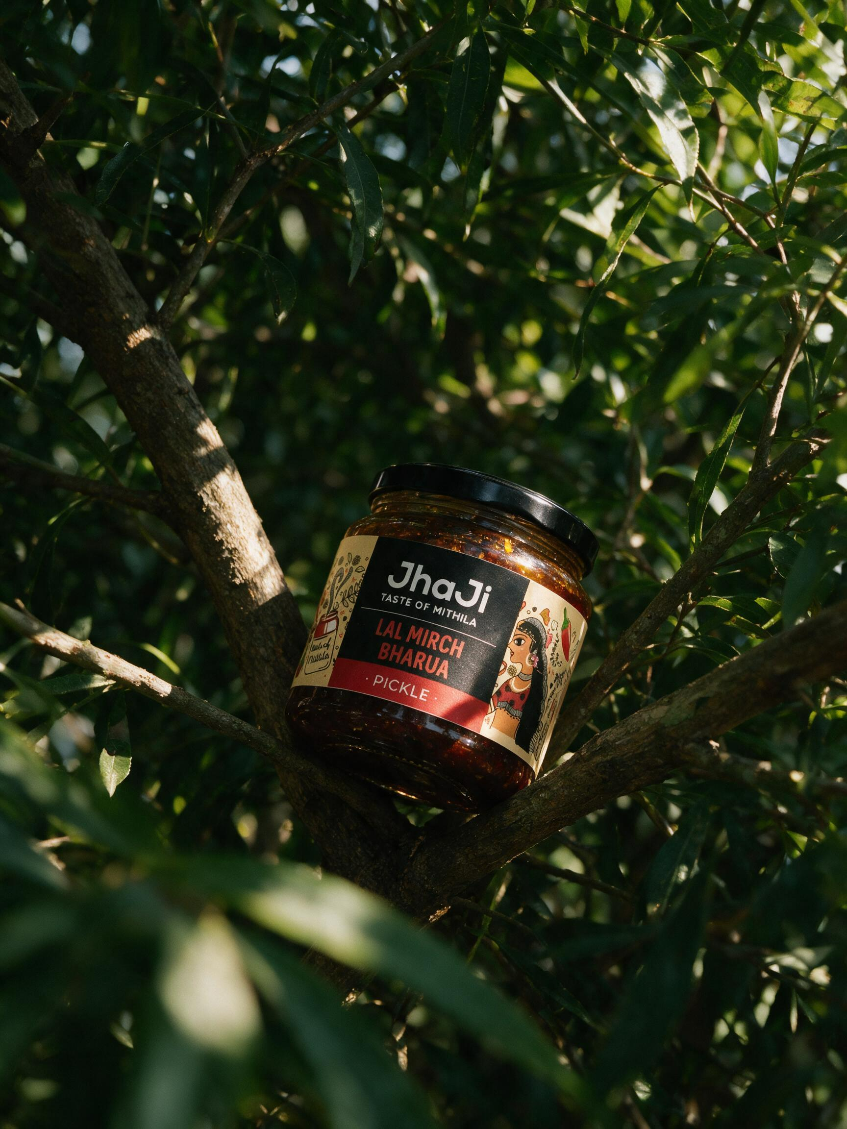
This is a strong choice when the product needs to communicate nature without looking like a studio set. Real branches, imperfect leaves and patches of direct sunlight create an organic editorial mood.
Best for: Skincare, haircare, fragrance, oils, wellness, natural food products and ingredient-driven brands.
COPY-AND-PASTE PROMPT
Create a premium photorealistic outdoor product photograph in vertical 4:5 aspect ratio, closely matching the natural composition and mood of the reference image.
PRODUCT — CRITICAL: Replace the bottle in the reference with [MY PRODUCT], using my uploaded product image as the exact visual reference. Preserve the real packaging precisely: bottle/jar shape, dimensions, proportions, cap or lid, material, transparency, product colour, label size and placement, logo, typography, graphics, print finish and all physical details. Do not redesign, recolor, simplify, distort or invent packaging.
COMPOSITION: Place a single product naturally resting between intersecting tree branches, positioned slightly below the centre of the frame. The product should lean gently at approximately 10–20 degrees rather than standing perfectly upright, as though it has been carefully placed within the tree.
Use one thick branch running diagonally from the upper-left toward the lower-right behind the product, with several smaller branches surrounding and physically supporting it. The placement must feel believable, with realistic contact between the product and branches.
NATURE SETTING: Dense, authentic green foliage fills the entire scene. Use long narrow leaves, small fresh leaves, textured woody branches and organically overlapping vegetation. Avoid decorative studio plants; this should feel like a genuine outdoor tree or garden environment. Allow some leaves to naturally overlap small portions of the product edges without obscuring the important front label.
FOREGROUND DEPTH: Add several leaves extremely close to the lens along the bottom-left and lower foreground, heavily blurred to create natural depth. Additional soft foliage can partially enter from the side edges. The product remains the visual focal point.
LIGHTING: Strong natural late-morning or afternoon sunlight filtering through the tree canopy. Create irregular patches of direct golden sunlight on the product, branches and leaves, mixed with deep natural shade. The product should catch a beautiful beam of warm sunlight while parts of the environment remain darker. Use realistic leaf shadows falling across the packaging and nearby branches. Highlights should feel slightly imperfect and naturally clipped like real outdoor photography rather than controlled studio lighting.
PRODUCT MATERIAL: Reproduce the actual product material accurately. If glass, show realistic glass thickness, edge reflections, refraction, subtle environmental reflections and believable light passing through the contents. If plastic, metal or matte packaging, preserve its true surface properties without adding artificial gloss.
CAMERA: Intimate editorial product photography, approximately 70–100mm equivalent lens, f/2–f/3.2, shallow depth of field, sharp focus on the product and immediate supporting branches, creamy organic foliage bokeh in the background. Camera positioned approximately at product height, slightly looking upward or straight toward the product rather than using a flat top-down angle.
TEXTURE & REALISM: Visible tree bark grain, tiny cracks, naturally imperfect leaves, small tears, veins, dust, minor discoloration, sunspots and irregular foliage. Avoid perfect synthetic greenery. Preserve realistic imperfections and natural outdoor randomness.
COLOR GRADE: Deep forest greens, warm earthy browns, golden sunlight, rich shadows and subtle filmic contrast. Slightly muted editorial colour response with gentle photographic grain, not hyper-saturated digital green.
Contemporary botanical product campaign, artisanal luxury branding, natural ingredient storytelling, outdoor editorial photography, cinematic but understated, realistic optics, authentic sunlight, photorealistic, ultra-detailed.
NO EXTRA TEXT: no headline, tagline, floating labels, advertising copy, badges, graphic overlays, watermark or additional typography. Only retain the branding and text physically printed on my actual product packaging.
Universal Add-On: Product Fidelity Lock
If you are building a longer campaign and want every image to use the same packaging, paste this block near the top of any prompt:
UNIVERSAL PRODUCT LOCK
PRODUCT FIDELITY — NON-NEGOTIABLE: Use my uploaded product as the exact source of truth. Preserve the same container geometry, proportions, cap/lid, material, transparency, label dimensions, label placement, logo, typography, artwork, colours, print finish and visible product contents. Do not redesign, beautify, simplify, add gloss, change the cap, stretch the label, replace text or invent packaging details. The environment may change; the product itself must remain visually consistent.
Universal Add-On: Real Human Skin & Hands
Use this whenever the product is held by a model or appears close to skin:
SKIN TEXTURE LOCK
SKIN & HANDS — IMPORTANT: anatomically correct hands with five fingers, believable grip and natural joint positions. Realistic skin with visible pores, tiny hairs/peach fuzz, fine lines, subtle wrinkles, natural nail texture, slight tonal variation, small imperfections and realistic highlights. Keep the skin human and non-airbrushed. Avoid waxy, plastic, porcelain, overly smooth or beauty-filtered texture.
Common Negative Instructions
NEGATIVE PROMPT / RESTRICTION BLOCK
Avoid: distorted packaging, changed logos, fake label text, duplicate products, extra fingers, fused fingers, impossible grips, warped jars, floating objects without believable contact, excessive gloss, plastic-looking food, synthetic leaves, perfect CGI surfaces, oversaturated colours, over-sharpening, random decorative text, badges, watermarks and poster typography.
Final Thoughts
Two categories worth a dedicated look if you’re working with Indian food or FMCG brands: pickle and achaar photography and spice brand photography both have distinct texture and colour problems these six general prompts don’t fully solve.
The strongest AI product images are not just “pretty.” They communicate something specific about the brand. A grocery-basket shot says retail and discovery. A hand-held image says human scale and lifestyle. A minimal floating stack says range and design. A botanical scene says ingredients and nature.
Use these prompts as starting frameworks rather than fixed recipes. Keep the product lock consistent, then adapt the scene to the product story. That approach makes it much easier to build a complete visual campaign where every image feels related without repeating the exact same composition.
For best typography results, generate the photography without extra text and add campaign copy later in your design tool. This gives you cleaner product images and much more control over hierarchy, fonts and layout.
FAQ
Can I use these prompts for any product?
Yes. Replace the product placeholder and update the ingredient or setting details so they make sense for your category. The product-fidelity section should remain unchanged.
How do I stop AI from changing my packaging?
Use a clean reference image and explicitly lock shape, proportions, cap, material, label placement, colours and surface finish. Repeat the same lock in every generation in a campaign.
Should I generate text inside the image?
For campaign work, it is usually better to keep the generated image free of extra text and add headlines later in a design tool. Preserve only the text that physically exists on the product.
What makes an AI product prompt look realistic?
Specific camera behaviour, believable contact shadows, material physics, imperfect textures, natural skin or food details, realistic depth of field and lighting that behaves consistently across the scene.