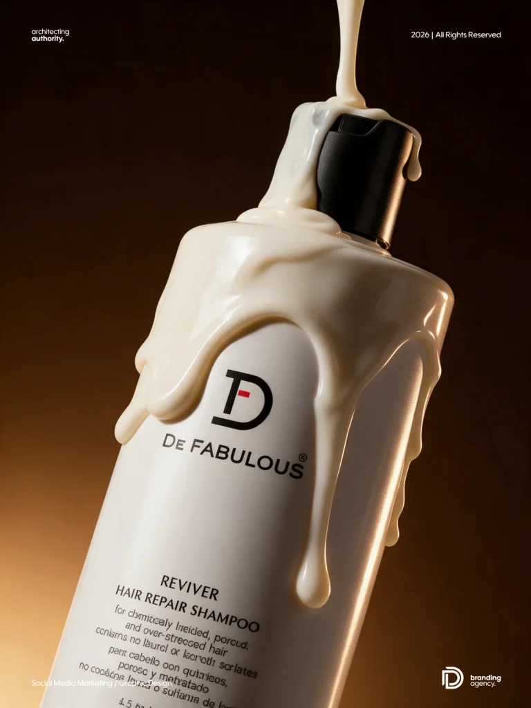
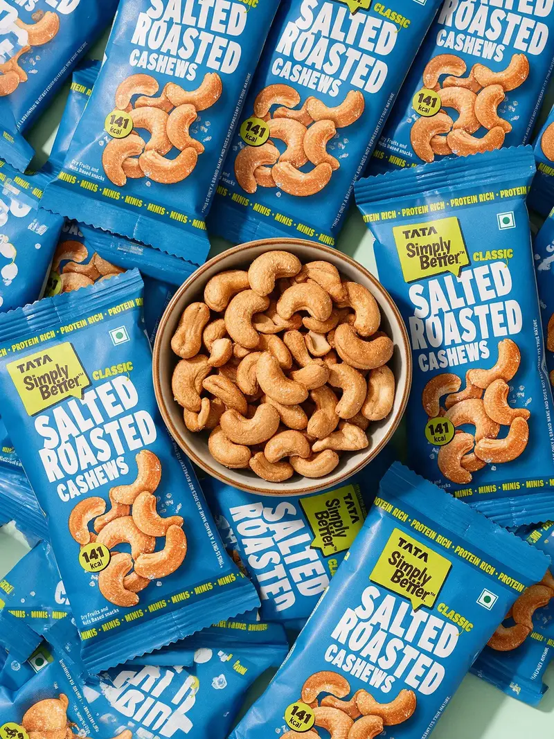
Use the uploaded product as the source of truth: preserve its branding, proportions and material texture while changing the creative composition around it.
Reference-locked product replacement prompts are useful when you want fresh campaign concepts without losing the product packaging, camera angle, hand position or material detail that makes the reference work. This guide contains eight detailed prompts created for snack and FMCG product photography.
Each prompt is written to preserve logos, typography, package proportions, folds, skin texture, fingers, nails, food texture and lighting. Upload your composition reference and your real product image, then adapt only the variables mentioned in the prompt.
How to use these product replacement prompts
- Upload the reference composition and a clean product or packaging image.
- Choose the prompt that matches your campaign format.
- Paste the complete prompt into your image-generation tool.
- Replace any product, ingredient or colour placeholders.
- Generate in the stated aspect ratio and inspect every logo, label, finger and package edge before approval.
Important: Image models can still alter small packaging text. Compare every output with the original product and regenerate or retouch inaccurate areas before commercial use.
Eight snack and FMCG product photography prompts
1. Game-Night Tabletop Packaging Composition
Image space: add the reference image or final generated output for this prompt.
Create a high-end, ultra-realistic commercial snack product photograph inspired by a playful tabletop game-night setup. Replace all snack packages in the scene with my uploaded product packaging, preserving the exact branding, logo, typography, label artwork, colors, package proportions, material, folds, crinkles, sealing edges and print details. Do not redesign or reinterpret the packaging.
COMPOSITION: Vertical 3:4 editorial product photography, photographed from a high three-quarter overhead angle. Build the tabletop from two contrasting zones: a bright pastel-pink surface with a thick dark-green geometric grid covering most of the frame, transitioning diagonally into a premium wooden chessboard in the upper-right corner.
Arrange four packages of my uploaded product naturally across the scene at different angles and depths: one upright package toward the upper-left, one hero package lying diagonally near the upper-middle/right partially overlapping the wooden chessboard, one package entering naturally from the lower-left edge, and another prominent package lying diagonally in the lower-right foreground. Keep every important logo and product name facing the camera and clearly readable.
Place a white oval serving tray with a thin red rim near the lower-middle/left. On it, place two small white ceramic ribbed bowls filled with realistic snack pieces. A realistic human hand enters from the left, naturally reaching into the front bowl and picking up one snack piece. Preserve realistic skin pores, fine lines, knuckles, fingernails, subtle veins and natural finger anatomy.
Add a few wooden and black chess pieces standing on the chessboard and several fallen chess pieces scattered naturally across the pink tabletop. Include a partially visible white bowl of snacks at the extreme upper-right edge. Keep props minimal enough that the packaging remains the visual hero.
LIGHTING: Strong warm directional studio sunlight coming from the upper-right, producing crisp graphic shadows from the packages, hand, bowls and chess pieces. Rich highlights on the flexible packaging without blowing out printed details. Realistic contact shadows and dimensional depth.
LOOK: Premium Gen-Z snack advertising, playful color blocking, editorial campaign photography, bold geometric composition, slightly surreal but physically believable, saturated pink/green/wood palette, tactile packaging texture, realistic food texture, sharp commercial product photography, high micro-detail, 4K.
CRITICAL PACKAGING RULE: Use the uploaded packaging exactly as supplied. Do not alter, invent, misspell, simplify or replace any visible branding or text. Maintain accurate package shape and dimensions. No duplicate logos, warped typography, fake text or additional branding.
CAMERA: High-angle three-quarter overhead view, approximately 35-50mm commercial product-photography perspective, deep enough focus for all hero packages to remain sharp.
Aspect ratio: 3:4. No added advertising text, captions, borders or watermarks.
2. Floating Product Over Sports Net
Image space: add the reference image or final generated output for this prompt.
Create an ultra-realistic commercial lifestyle product photograph using the supplied reference image as the exact composition and camera reference. Replace only the existing product with my uploaded product packaging.
COMPOSITION LOCK – DO NOT CHANGE: Preserve the exact camera position, framing, perspective, crop, subject scale, negative space, and spatial relationships of the reference. Use the same slightly elevated, upward-looking courtside perspective. Keep the product floating in exactly the same central-upper position, at the same approximate size and distance from camera, with the same slight diagonal orientation and perspective.
Preserve the bright saturated cyan-blue sports court/background, including its realistic rough painted surface, tiny speckles, grain and imperfections. Maintain the lime-green horizontal net/border crossing diagonally through the lower-middle portion of the frame. Keep the thin dark net strings in exactly the same visual area.
HAND POSITION LOCK: A dark-brown-skinned hand and forearm enters from the lower-left, reaching upward toward the floating product. Preserve the exact arm direction, wrist angle, open-finger gesture, finger spacing and perspective. Maintain realistic pores, skin grain, knuckles, nail texture, subtle highlights and natural anatomy. Keep the green manicure and layered green/pearl bracelets.
A second lighter-skinned hand enters from the lower-right, reaching upward with an open palm. Maintain the same position, scale, finger spread, perspective and partial crop. Do not move either hand closer to or farther from the product.
PRODUCT REPLACEMENT: Replace the original product only with my uploaded packaging. Preserve my packaging exactly: correct dimensions, shape, material, thickness, seams/folds, surface texture, logo, typography, graphics, colors and all visible printed information. Adapt its perspective naturally to match the floating product’s existing orientation rather than redesigning the package.
The packaging must look genuinely suspended in mid-air between the two players, captured at the decisive moment of being tossed across the net. Add only extremely subtle physically believable motion energy – the package itself remains sharp and readable.
TEXTURE PRIORITY: Retain visible skin pores and fine lines, individual nail details, bracelet materials, rough granular court texture, painted-surface imperfections, net fibers and stitching, packaging material texture, realistic edge highlights and natural contact/depth cues. Avoid plastic-looking skin or overly clean CGI surfaces.
LIGHTING LOCK: Maintain the reference’s strong direct outdoor sunlight, crisp directional highlights, rich saturated colors and realistic shadows. Match the original contrast and exposure.
Premium Gen-Z editorial advertising photography, energetic sports-campaign aesthetic, bold complementary blue-and-lime palette, photorealistic, highly tactile, crisp commercial photography, natural imperfections, 4K detail.
CRITICAL: Do not alter the camera angle. Do not reposition the hands. Do not change finger poses. Do not change the net position. Do not simplify the background texture. Do not introduce additional props or people. Do not add text outside the packaging. Do not modify, regenerate, misspell or reinterpret the branding printed on my uploaded package.
Aspect ratio: 3:4 vertical.
3. Model Buried in Snack Packages
Image space: add the reference image or final generated output for this prompt.
Create an ultra-realistic, high-fashion commercial snack campaign photograph based on the supplied reference. Replace every visible snack package with my uploaded packaging, while keeping the original photographic composition almost completely locked.
CAMERA & COMPOSITION LOCK: Maintain the exact vertical framing, straight-on camera position, close portrait crop, lens perspective, subject scale and camera distance. The model is lying flat on a dark charcoal/black textured floor, photographed directly from above. His upper torso fills the frame vertically, with his head near the upper center and his body extending toward the bottom.
MODEL POSITION: Keep the model’s face partially buried behind the packages in exactly the same way. Only the forehead, curly textured hair, eyes, nose and open mouth are clearly visible between the products. Preserve the exaggerated surprised/shocked expression – eyes wide open, mouth open, playful advertising energy.
PACKAGE ARRANGEMENT LOCK: Surround and cover the model with approximately 8-10 packages of my uploaded product, creating a dense, intentionally chaotic layered arrangement. Packages overlap one another around his head, shoulders and chest. Keep the same visual hierarchy: one large package dominating the upper-right foreground, large packages behind the head on the upper-left and center-left, one large hero package over the center-right chest, another package across the lower-center/left chest, with additional packages partially cropped along both frame edges.
Rotate packages naturally at slightly different angles while maintaining the reference composition. Some should sit closer to camera and others partially underneath, creating realistic dimensional layering. Do not arrange them into a clean grid.
HANDS & BODY LOCK: Preserve both hands in the foreground exactly like the reference. The left hand enters from the lower-left and spreads naturally across the center-left package. The right hand enters from the lower-right and stretches diagonally across the center package. Maintain the same finger spacing, overlapping fingers, wrist direction, hand scale and foreshortening. Hands should look like the model is desperately hugging and holding the pile of products against his chest.
Maintain extremely realistic skin texture – visible pores, tiny wrinkles around joints, subtle veins, knuckle definition, cuticles, nail texture, natural skin variation and slight imperfections. No smooth AI/plastic skin. Preserve realistic curly hair with individually visible strands and flyaways.
PACKAGING ACCURACY: Use my uploaded packaging exactly as supplied. Preserve the original package dimensions, flexible-material construction, seams, crinkles, wrinkles, folds, edge seals, glossy/matte behavior, printed artwork, colors, logo, typography and product imagery. Packages must physically deform slightly where the model’s fingers press against them.
Do not redesign the packaging. Do not invent flavors, colors, logos or typography. Do not misspell or regenerate visible text. Multiple packages may use different uploaded variants if provided.
LIGHTING: Preserve the reference’s hard directional flash/editorial lighting. Strong highlights on the face, hands and packaging with deeper shadows between overlapping packages. Dark textured background stays understated. Maintain subtle photographic grain rather than an overly polished CGI finish.
AESTHETIC: Quirky Gen-Z snack campaign, playful maximalism, fashion-editorial product photography, intentionally chaotic composition, tactile materials, punchy colors, slight analog-camera character, realistic flash photography, high micro-detail, photorealistic 4K.
CRITICAL LOCKS: Exact overhead camera angle; same close crop; same model position; same shocked expression; same hand placement; same package layering density; same package scale variation; same dark background; same hard-light character; preserve skin, hair and packaging texture.
Only the packaging design/product should change.
Aspect ratio: 2:3 vertical. No added text, captions, borders or watermarks.
4. Product Emerging From Ingredient Landscape
Image space: add the reference image or final generated output for this prompt.
Create an ultra-realistic commercial product campaign photograph based closely on the reference image. Replace only the beverage can with my uploaded product packaging, while maintaining the same concept, camera angle, composition, hand position, textures, lighting and visual proportions.
CAMERA & COMPOSITION LOCK: Square 1:1 composition, straight-on camera at approximately product height with a very slight downward perspective onto the foreground. Keep the hero product perfectly centered vertically and horizontally. Preserve the large amount of clean negative space in the upper background and the dense ingredient foreground occupying roughly the lower 55-60% of the frame.
INGREDIENT ENVIRONMENT: Create a huge mound of the main ingredient/flavor associated with my uploaded product instead of raspberries. Use hundreds of individual pieces extending from foreground to background, completely filling the bottom half of the scene. The ingredients closest to camera should appear large and extremely detailed, gradually becoming smaller toward the back to create realistic depth.
Preserve extremely tactile food texture: natural pores, bumps, fibers, tiny imperfections, moisture, subtle color variation and realistic specular highlights. Avoid identical duplicated pieces or artificial CGI repetition.
ARM + HAND POSITION LOCK: A realistic human forearm emerges vertically upward from the center of the ingredient pile, partially buried so the wrist appears naturally surrounded by the ingredients. The hand holds the product upright at the top center. Preserve the same grip: fingers wrapping around the left side/front edge, thumb supporting from behind/right, relaxed but secure grip. Maintain realistic finger anatomy, knuckles, cuticles, nail beds, pores, fine lines, subtle veins and natural skin variation.
PRODUCT REPLACEMENT: Replace the can with my uploaded packaging. Keep its actual shape and proportions – do not force it into a can shape. Position it upright, front-facing and centered, approximately the same visual hero scale as the original product. The main front branding should face directly toward camera and remain unobstructed by the hand.
Preserve my uploaded packaging exactly: logo, typography, colors, artwork, flavor information, product imagery, package dimensions, seals, edges, folds/crinkles if flexible, surface finish and material texture. Do not redesign, simplify, invent or misspell packaging details.
The hand must realistically interact with the actual package shape. Add subtle pressure/deformation only if the uploaded packaging is flexible; keep rigid packaging structurally rigid.
BACKGROUND: Replace the raspberry-pink background with a rich studio color derived naturally from the uploaded product’s dominant branding/flavor palette. Smooth seamless backdrop with a subtle center glow and gentle edge falloff – no horizon line and no distracting props.
LIGHTING: Premium studio advertising light – large soft key light from upper-left/front, subtle fill from the opposite side, controlled highlights across the packaging, realistic shadows between ingredients, gentle dimensional shadow around the arm and crisp readable branding. Keep the scene saturated and punchy without clipping highlights.
AESTHETIC: Playful Gen-Z food advertising, surreal ingredient landscape, bold monochromatic color story, premium editorial product photography, tactile macro food textures, realistic human skin, sharp hero packaging, high micro-detail, photorealistic 4K.
CRITICAL: Maintain the reference camera angle; centered product position; vertical arm position; exact reaching/holding concept; ingredient mound height; foreground perspective; product-to-hand scale; negative space; studio-lighting character. Only adapt the product, ingredient and background color to my uploaded packaging.
No floating ingredients, no extra hands, no duplicate products, no added advertising text, no watermark.
Aspect ratio: 1:1.
5. Laundry-Line Hanging Snack Packages
Image space: add the reference image or final generated output for this prompt.
Create an ultra-realistic commercial snack product photograph inspired by the supplied reference image. Replace all visible snack bags with my uploaded product packaging, while preserving the exact camera angle, hanging concept, package positions, spacing, perspective, lighting and tactile realism.
CAMERA & COMPOSITION LOCK: Vertical 4:5 composition, straight-on eye-level product photography. Keep a bright blue sky/background occupying most of the frame, with soft white clouds near the upper area. A natural twisted clothesline stretches horizontally across the upper third of the image.
PRODUCT POSITION LOCK: Hang three hero packages from the clothesline using simple natural wooden clothespins. Keep the arrangement almost identical to the reference: left package positioned slightly higher and angled subtly clockwise; center package hanging slightly lower, facing almost directly toward camera with a gentle natural tilt; right package positioned higher again and angled slightly inward.
Allow tiny portions of additional packages to be cropped naturally at the extreme left and right edges, creating the feeling of a longer clothesline continuing beyond the frame.
PACKAGING REPLACEMENT: Every visible package must use my uploaded packaging. Maintain its exact original dimensions, bag shape, branding, logo, typography, graphics, colors, flavor information, seals and material finish. Do not redesign it or convert it into the shape of the reference packages.
Preserve realistic flexible-packaging behavior: subtle wrinkles, small creases, crimped top and bottom seals, gentle bulging from the snacks inside, tiny tension where each wooden clothespin grips the upper seam, realistic glossy/matte reflections and slight deformation caused by gravity.
The packages should feel physically hanging, not floating. Each bag should have a slightly different natural rotation and subtle sag while keeping the front branding clearly visible.
FOREGROUND / LAUNDRY SET: Maintain the playful laundry-day styling. A pale gray-and-white striped tabletop fills the bottom portion. Place a soft yellow towel casually folded on the lower-left, a small woven cream basket filled with natural wooden clothespins near the center, several loose clothespins scattered nearby, a rectangular wooden-bristle laundry brush in the lower-right foreground, and a tall minimal white laundry basket partially visible along the right edge.
Maintain accurate textures throughout: individual towel fibers, woven basket strands, unfinished wooden clothespin grain, stiff brush bristles, subtle molded texture on the laundry basket, woven clothesline fibers and fine packaging wrinkles.
LIGHTING: Bright sunny outdoor advertising light, coming from the upper-left/front. Crisp but slightly softened shadows, warm highlights on wooden props, realistic reflections across the packaging, clean daylight whites and vibrant saturated colors. Preserve the cheerful high-key exposure of the reference.
DEPTH: Keep all three hanging packages tack-sharp and visually dominant. Foreground laundry props remain detailed but secondary. Background sky has a soft atmospheric quality without artificial blur.
AESTHETIC: Playful Gen-Z FMCG campaign; summer laundry-day concept; bold colorful editorial product photography; clean blue-sky backdrop; slightly surreal concept executed photorealistically; tactile packaging; premium advertising photography; realistic material imperfections; 4K detail.
CRITICAL LOCKS: Same straight-on camera angle; same three-package hanging arrangement; same package scale; same clothesline height; same clothespin placement concept; same blue-sky negative space; same laundry props; same tabletop height; same bright daylight character.
Do not alter or invent any text on my uploaded packaging. Do not add unrelated branding, labels, captions or watermarks.
Aspect ratio: 4:5 vertical.
6. Game-Night Bowl + Hand Macro
Image space: add the reference image or final generated output for this prompt.
Create an ultra-realistic, high-end editorial snack campaign photograph based closely on the supplied reference. Replace the peanuts/snack pieces with my uploaded product or the actual food contained in my packaging, while preserving the camera angle, composition, hand position, lighting, textures and game-night styling.
CAMERA LOCK: Square 1:1 composition, intimate close-up tabletop photography from a high three-quarter overhead angle, approximately 45-55 degrees downward. Keep the bowl centered slightly below the middle of frame and filling roughly the same percentage of the image. Maintain the tight crop and close commercial-food-photography perspective.
BOWL & FOOD: Place a round, off-white speckled ceramic bowl in the center, generously filled with my snack. Reproduce the snack accurately – correct shape, size, seasoning, irregularity and surface texture. Show extremely detailed seasoning powder, toasted areas, tiny crumbs, pores, rough edges and natural color variation. The bowl should feel abundant and casually overflowing.
Scatter several individual snack pieces naturally across the lower-left and lower-center foreground, with a few crumbs and seasoning particles between them. Avoid artificial repetition; every piece should have slightly different rotation, shape and texture.
HAND POSITION LOCK: A realistic feminine hand enters vertically from the upper-center of frame and reaches directly into the bowl. Preserve the same gesture: wrist outside the top crop, palm facing downward, index/middle fingers reaching toward the food, fingers gently curved and separated. The fingertips appear just above or lightly touching the snack.
Maintain highly realistic skin – visible pores, fine creases around finger joints, subtle veins, cuticles, tiny imperfections and natural tonal variation. Keep the long almond-shaped manicure in saturated mustard/yellow, with realistic nail curvature and a smooth semi-gloss finish. No distorted fingers or plastic skin.
TABLETOP: Maintain the bold retro mustard-yellow tiled tabletop with thick warm-white grout lines, creating the same strong geometric grid beneath the bowl. Preserve subtle tile texture, tiny imperfections and realistic specular highlights.
GAME-NIGHT PROPS: Keep the same surrounding lifestyle elements: partially cropped stemmed cocktail glass at upper-left containing an amber/orange drink; partially cropped coupe glass at upper-right containing a coral-pink drink with a thin fresh lime wheel floating on top; another cropped glass base/stem entering from the right edge; and a partially cropped Ace of Spades playing card in the lower-right corner.
Keep every prop in approximately the same position, scale and crop as the reference. Props should frame the hero bowl rather than compete with it.
LIGHTING LOCK: Strong direct hard-flash/studio lighting from upper-left/front, creating crisp dramatic shadows from the hand, bowl, glasses and scattered snacks. Maintain punchy highlights, deep clean shadows and saturated warm colors. The aesthetic should feel like direct-flash editorial photography rather than soft food photography.
TEXTURE PRIORITY: Preserve micro-detail in skin pores, fingernails, ceramic speckles, seasoning granules, crumbs, lime pulp, condensation/glass reflections, liquid surface, tile texture and paper playing-card texture.
LOOK: Playful Gen-Z game-night campaign; premium FMCG photography; retro 1970s color palette; bold yellow color blocking; hard-flash editorial aesthetic; tactile macro food photography; slightly imperfect analog character; photorealistic; 4K.
CRITICAL LOCKS: Exact high three-quarter camera angle; same tight crop; same centered bowl position; same hand entry and finger pose; same yellow manicure; same scattered-snack arrangement; same glasses and playing-card positions; same tiled grid perspective; same hard-light direction.
Do not include the product packaging in this particular shot unless specifically requested – the actual snack/food is the hero. No added text, logos or watermark.
Aspect ratio: 1:1.
7. Inside-the-Pack Hand Picking Snack
Image space: add the reference image or final generated output for this prompt.
Create an ultra-realistic macro commercial snack photograph based closely on the supplied reference. Replace the existing round snacks with my uploaded product / the actual snack contained in my packaging, while maintaining the exact camera perspective, hand position, torn-package framing, lighting and tactile material detail.
CAMERA & POV LOCK: Square 1:1 composition, camera positioned inside the snack bag looking outward/upward through the torn opening. Extremely close, immersive macro perspective, as though the viewer is one of the snacks inside the package. Use a wide close-up perspective with strong foreground depth. Do not convert this into a normal exterior product shot.
PACKAGING INTERIOR: The inside walls of the opened package surround the image from the top, left and right edges, creating an irregular tunnel-like frame. Preserve the dramatically crumpled flexible foil structure, sharp folds, wrinkles, creases, torn opening and uneven edges.
Show extremely detailed metallic packaging material: reflective foil, micro-wrinkles, stretched areas, tiny scratches and realistic crimping. The reflective interior catches intense orange, copper, magenta, violet and cyan highlights, creating a premium iridescent metallic effect.
OPENING POSITION: Maintain the large irregular opening in approximately the upper-middle/center of frame. Through this opening, show a clean bright cyan-blue background, creating strong complementary contrast against the warm orange snack and metallic foil.
HAND POSITION LOCK: A realistic human hand enters through the opening from the upper-right/center, reaching downward into the bag. Preserve the same wrist direction, hand rotation and pinching gesture. Thumb and index finger gently pick up one individual snack piece near the center of frame.
Keep the picked snack clearly separated from the pile and positioned just below the fingertips. Maintain realistic finger pressure where the snack is held.
HAND / FINGER / NAIL LOCK – HIGHEST PRIORITY: Reproduce the hand from the reference as closely as possible. Do not beautify, stylize, smooth, reshape or reinterpret the hand. Maintain the exact hand orientation, wrist angle, perspective, scale and distance from camera.
Preserve the exact thumb-and-index-finger pinching gesture used to pick up the single snack. Match the finger curvature, spacing, joint bends, fingertip pressure and natural foreshortening. Keep the middle, ring and little fingers positioned naturally behind the pinching fingers, following the same perspective and anatomical arrangement as the reference.
Skin texture must remain highly photorealistic: visible pores, fingerprint ridges, fine creases, knuckle folds, subtle dryness, tiny skin imperfections, natural tonal variation, soft veins and realistic highlights. Retain the small compression folds where the fingers bend and where the thumb/index finger grip the snack. No airbrushed skin, no waxy texture, no excessive smoothing.
NAILS: Preserve the reference’s natural short fingernails – same approximate length, rounded shape, natural translucent pink/nude tone, visible nail beds, subtle cuticles and realistic slightly imperfect edges. No manicure, no nail polish, no long nails, no acrylic nails and no artificial gloss.
CAMERA ANGLE LOCK: Camera remains inside the opened snack packet looking upward/outward, using the same extreme close-up, low internal POV. The hand reaches through the opening from the upper-right/center toward the camera. Maintain the same wide-angle perspective and foreshortening – the hand should feel physically close to the lens while the wrist recedes through the opening.
SNACK FOREGROUND: Fill approximately the lower 35-45% of the frame with a dense pile of my snack pieces. The closest pieces should appear larger due to the internal-bag perspective. Maintain the actual product’s shape rather than forcing it into the round shape shown in the reference.
Reproduce extremely tactile food texture – seasoning granules, spice powder, fried/toasted texture, pores, cracks, rough edges, crumbs, subtle oil sheen and natural irregularity. Every snack should vary slightly in rotation, size and surface pattern. Avoid obvious duplication.
DEPTH OF FIELD: Hero snack between the fingers and nearby hand remain critically sharp. Foreground snacks retain substantial texture while gradually softening at the extreme nearest edge. Foil edges may transition naturally between sharp and softly blurred areas due to their distance from the focal plane.
LIGHTING: Cinematic commercial lighting from outside the package. Bright cyan ambient light enters through the opening while warm orange/red light bounces around the reflective foil interior. Strong specular reflections, glowing foil edges, realistic shadow pockets between snacks and dramatic dimensional contrast.
COLOR: Electric cyan background + fiery orange food + copper/orange foil + selective pink, purple and blue reflections. Saturated but photorealistic.
AESTHETIC: Immersive POV snack advertising; inside-the-pack perspective; surreal Gen-Z FMCG campaign; extreme macro food photography; cinematic metallic reflections; tactile seasoning detail; playful premium advertising; photorealistic 4K.
CRITICAL LOCKS: Camera stays inside package; same low internal POV; same torn opening size and position; same hand entry direction; same thumb-and-index pinch; one snack being lifted; dense snack pile across bottom; same metallic tunnel framing; same cyan negative space; same dramatic warm/cool lighting. Do not change hand position, finger count, finger proportions, nail shape, skin tone, skin texture, grip position, wrist direction, camera height, camera tilt, lens perspective, or distance between hand and snack pile.
Anatomical accuracy is critical: exactly five natural fingers, correctly connected joints, realistic thumb anatomy, no fused fingers, no duplicated fingers, no missing fingers, no warped nails, no unnaturally elongated fingertips.
The only major replacement should be the snack itself. Keep the hand, camera perspective, foil framing and overall composition visually matched to the reference.
Do not show the exterior front branding of the package. Do not add text, extra hands, utensils or unrelated props.
Aspect ratio: 1:1.
8. Ground-Up POV Through Snack Packages
Image space: add the reference image or final generated output for this prompt.
Create an ultra-realistic commercial snack campaign photograph using the supplied image as the strict camera, composition, lighting, hand, sky and material-texture reference. Replace only the center snack package with my uploaded product packaging.
CAMERA ANGLE – STRICT LOCK: Preserve the exact extreme low-angle POV from inside/between multiple snack bags looking vertically upward toward the sky. The camera is positioned very low, almost at the bottom of the pile, with surrounding packages forming an irregular frame around all four edges. Maintain the same wide-angle perspective, dramatic foreshortening, camera height, upward tilt, central opening and depth relationships. Do not turn this into a normal front-facing product shot.
HERO PRODUCT POSITION: My uploaded package is held vertically in the exact center of the opening, suspended directly above the camera. Match the reference product’s scale, distance from lens, front-facing orientation and slight natural perspective distortion. The package occupies approximately the same central area while leaving visible blue sky around it.
PRODUCT TEXTURE – HIGHEST PRIORITY: Preserve my uploaded packaging exactly – correct bag dimensions, proportions, logo, typography, colors, graphics, flavor information and printed artwork. Maintain realistic flexible-plastic construction with micro-wrinkles, crinkles, folded corners, crimped seals, tiny tension lines, subtle dents and natural bulging from the food inside. Show realistic semi-gloss reflections and slight translucency where strong sunlight strikes thin areas of the material.
Do not make the package perfectly flat, rigid or CGI-clean. Do not redesign, simplify, misspell or invent any packaging text.
HAND LOCK: A single realistic hand reaches down from the upper-right side, gripping the center package from behind and along its side exactly like the reference. Preserve the wrist direction, hand rotation, finger placement, grip pressure and foreshortening.
Keep the hand extremely natural: visible pores, fingerprint texture, fine wrinkles, knuckle folds, subtle veins, cuticles, nail beds, tiny imperfections and realistic tonal variation. Natural short unpolished nails, slightly translucent with authentic nail texture. No manicure, long nails, smoothing or plastic-looking skin. Fingers should create believable pressure and subtle deformation in the flexible package.
SKY TEXTURE LOCK: Maintain the bright natural cyan-to-light-blue daytime sky, photographed directly upward. Include soft irregular white clouds with realistic atmospheric softness, delicate wispy cloud detail and natural brightness variation. The sky must look photographic – not a flat blue studio backdrop or artificial gradient.
SURROUNDING PACKAGES: Multiple packages remain extremely close to the lens around the top, bottom, left and right edges, heavily cropped and partially out of focus. They create a tunnel/frame around the central product. Preserve their large distorted scale caused by proximity to the wide-angle lens. Show realistic folds, printed surfaces, translucent highlights and dark shadowed areas. They should remain secondary and must not obstruct the hero package.
LIGHTING: Natural strong daylight from directly above. Bright backlighting around the hero product and hand, realistic rim highlights along package edges, slightly darker shadowed underside of the hand, subtle light passing through thin packaging areas and high dynamic range between the bright sky and shaded foreground bags.
Preserve real photographic imperfections: slight highlight bloom, subtle atmospheric haze, tiny packaging scratches, uneven reflections, fine film-like grain and realistic optical contrast. Avoid excessive HDR or synthetic sharpness.
CRITICAL LOCKS: Exact ground-up POV; same extreme low camera position; same wide-angle lens perspective; same central hero-product placement; same hand entry from upper-right; same grip; same natural nail appearance; same package-to-hand scale; same blue-sky opening; same cloud texture; same surrounding-package framing; same backlit daylight.
Only replace the center product with my uploaded packaging. Everything else should remain compositionally matched to the reference.
Photorealistic FMCG campaign photography, tactile materials, natural daylight, high micro-detail, realistic optics, 4K.
Aspect ratio: 3:4 vertical. No added text, watermark or additional props.
How to get more accurate product images
- Use a sharp, front-facing product image with readable packaging.
- Keep the product reference separate from the composition reference.
- Repeat packaging-preservation instructions near the end of the prompt.
- Check hands, fingernails, contact shadows, reflections and package deformation.
- Generate several variations before selecting the final commercial frame.
Frequently asked questions
Can I use these prompts with any snack or FMCG product?
Yes. Replace the product, ingredient and colour references while keeping the composition, camera and texture instructions intact.
Which AI image tools can use these prompts?
They can be adapted for ChatGPT Images, Seedream, Midjourney, Gemini, Flux and other tools that support reference-image generation.
Will AI preserve every word on the packaging?
Not always. Strong reference images and explicit preservation rules help, but you should inspect logos, labels and small typography before using an image commercially.
Do I need both a reference image and a product image?
Yes. The reference image supplies the composition and lighting, while the product image supplies the packaging, proportions and branding that must be preserved.
Which aspect ratios are included?
The collection includes 3:4, 2:3, 1:1 and 4:5 compositions for social posts, campaign images and product-focused creative.
Final takeaway: Treat the uploaded product as the source of truth. Change the creative world around it, but keep its branding, structure and material behaviour accurate.
Found your next idea?
Explore prompt packs