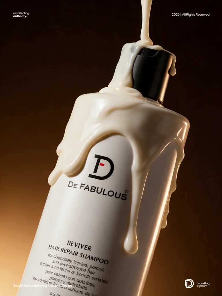
Strong product replacement prompts lock packaging accuracy first, then control composition, lighting and human interaction.
Product replacement is one of the most useful AI image workflows for brands. The challenge is keeping the real packet, bottle, jar or box accurate while changing the scene around it. This collection gives you eight reusable prompts for FMCG, snack, beverage and lifestyle campaigns, with a finished example beside every prompt.
Inside this guide: 8 detailed product-replacement prompts covering flat lays, lifestyle advertisements, group scenes, studio campaigns and on-the-go product photography.
How to use these AI product image prompts
- Upload a clear, front-facing product reference before pasting a prompt.
- When a concept includes a person, upload the model reference in the same generation request.
- Replace every bracketed placeholder with information about your real product and campaign.
- Keep the product-accuracy and avoidance instructions unchanged.
- Review the packaging text, logo, proportions, hands and food texture before approving the image.
Placeholder key
- [MY UPLOADED PRODUCT] – the exact packet, bottle, jar, box or container reference.
- [MY UPLOADED MODEL] – the person whose identity, skin tone and facial structure must be preserved.
- [BACKGROUND COLOUR] – a brand-aligned colour with enough contrast around the product.
- [MAIN INGREDIENT OR FLAVOUR] – the real ingredient or visual cue associated with the product.
- [APPROPRIATE DIP OR ACCOMPANIMENT] – include only when it suits the real product.
Eight product image generation concepts
Use the index below to jump to the campaign format you need.
- Overhead Snack Packet Flat Lay – 3:4 vertical
- Kolkata Toto Lifestyle Advertisement – 3:4 vertical
- Diagonal Product Packet Cascade – 9:16 vertical
- Product Range in Colourful Crate – 3:4 vertical
- Game Night Product Flat Lay – 4:5 vertical
- Excited Living Room Watch Party – 3:4 vertical
- Hands Reaching for Hero Product – 4:5 vertical
- Tote Bag On the Go Product Shot – 4:5 vertical
1. Overhead Snack Packet Flat Lay
Recommended aspect ratio: 3:4 vertical
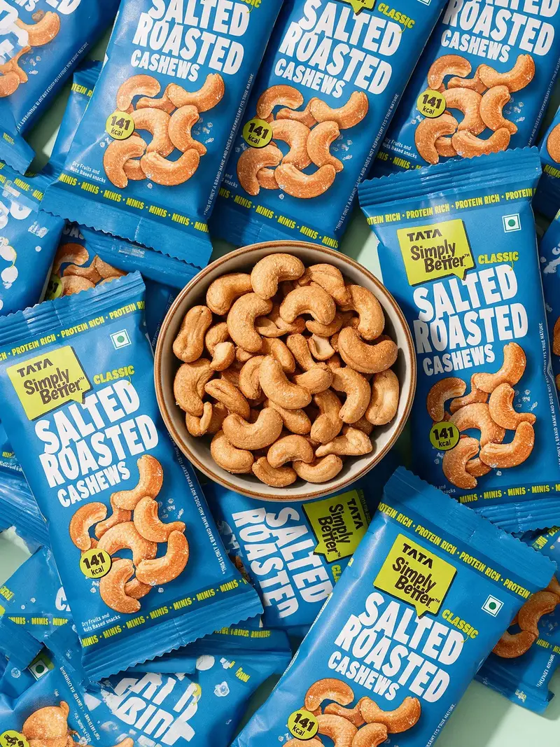
Create an ultra-photorealistic overhead commercial snack-product flat lay using [MY PRODUCT PACKET] as the exact product reference. Replace every branded packet in the reference scene with multiple packets of [MY PRODUCT], while strictly preserving the original packaging design.
Composition
Create a dense, energetic arrangement of approximately 12–15 packets scattered across the entire frame. Packets overlap naturally at different angles, with several partially cropped by the edges to create an abundant, edge-to-edge composition. Place a simple round ceramic bowl in the centre, filled generously with the actual snack contained in [MY PRODUCT]. The bowl is viewed directly from above and remains the visual focal point. Show a balanced mixture of full front-facing packets, slightly rotated packets, partially overlapped packets, packets entering from every edge, and natural soft folds, wrinkles and realistic air-filled volume. If multiple flavours are uploaded, distribute them evenly while preserving each flavour’s correct packaging and snack appearance.
Photography and lighting
Use an exact 90-degree top-down flat-lay camera angle and a 35–50mm commercial lens perspective. Use bright diffused studio lighting with gentle directional shadows beneath the packets and bowl. Maintain crisp packaging, realistic plastic-film reflections, visible seams and natural crinkles without harsh glare. Use a clean [BACKGROUND COLOUR] surface that contrasts with the packaging while keeping the image colourful, fresh and high-energy.
Food styling
The snack inside the bowl must accurately match [MY PRODUCT] in shape, size, seasoning, texture and colour. Show realistic toasted surfaces, individual seasoning particles and slight natural variation. Keep the bowl full and appetising, with no food covering the packaging.
Product accuracy
Preserve the exact packet shape, dimensions, colours, material finish, sealed edges, logo, typography, product name, flavour name, illustrations, certification marks and all visible label details.
Do not redesign, reinterpret, simplify, blur, misspell or invent packaging text.
Avoid
Incorrect or unreadable labels, altered branding, invented flavours, warped packets, excessive glare, repeated identical folds, deformed bowl, incorrect snack pieces, empty areas, hands, people, extra props, floating objects, text outside the original packaging, watermark or border.
2. Kolkata Toto Lifestyle Advertisement
Recommended aspect ratio: 3:4 vertical
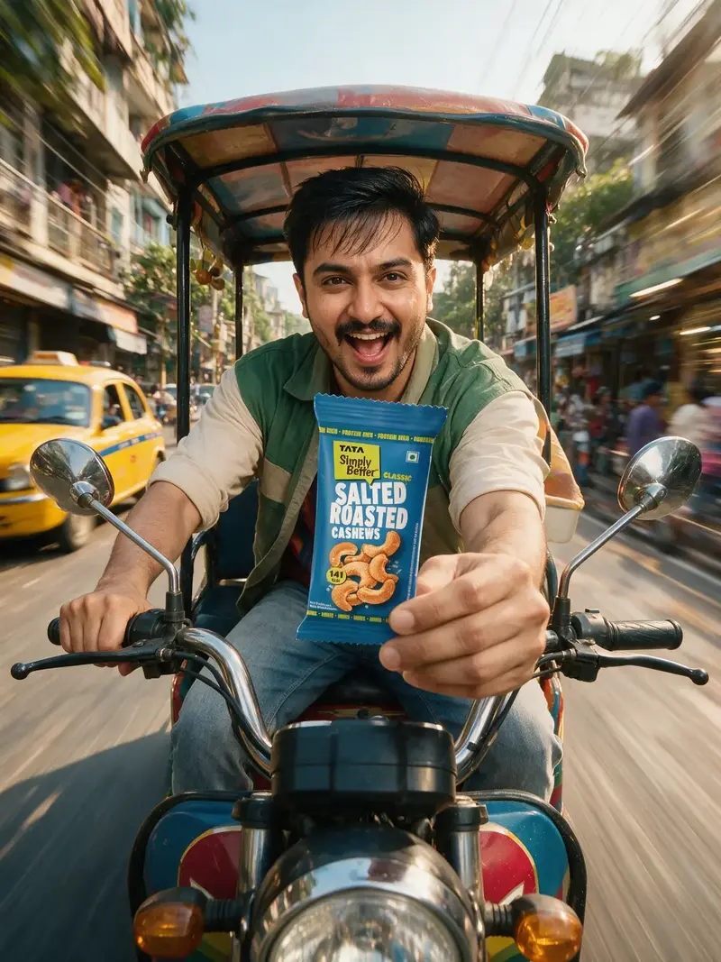
Create an ultra-photorealistic, energetic commercial lifestyle advertisement featuring [MY UPLOADED MODEL] riding a colourful Indian electric toto or e-rickshaw through a lively Kolkata street while confidently holding [MY UPLOADED PRODUCT] toward the camera.
Model identity
Preserve the model’s recognizable facial structure, skin tone, eyes, nose, lips, jawline, hairstyle and body proportions. Retain authentic skin texture with visible pores, subtle marks, fine facial hair and natural tonal variation. Avoid airbrushed or plastic-looking skin.
Composition and pose
Use a dynamic, front-facing, slightly low camera angle as though the camera is moving directly ahead of the toto. Seat the model in the driver’s position with a joyful, energetic expression, looking directly at the camera. One hand stays securely on the handlebar while the other extends [MY PRODUCT] slightly toward the lens. Keep the face completely visible beside or above the product. Show enough of the toto’s front body, handlebars, mirrors and colourful canopy to make the vehicle immediately recognizable. Make the pose spontaneous and adventurous while remaining anatomically and physically believable.
Product accuracy
Preserve the packaging shape, proportions, brand logo, product name, colours, graphics, flavour name, typography, label placement, certification marks, material, folds and sealed edges. Keep the front label facing the camera. Grip only the lower side or edge so the hand does not hide the main branding.
Location and movement
Set the scene on a vibrant Kolkata neighbourhood road in warm daylight, with softly recognizable yellow taxis, old buildings, balconies, roadside shops, greenery and distant pedestrians. Create strong directional motion blur and radial speed streaks along the street and buildings, while keeping the model, product and front of the toto perfectly sharp.
Styling and lighting
Dress the model in a youthful casual outfit using colours that complement the packaging. Use warm golden sunlight, soft facial illumination and subtle rim light around the hair and shoulders. Add realistic reflections on the mirrors, metal handles and product packet.
Avoid
Motorbike or scooter instead of a toto, oversized product, obscured face, incorrect hands, extra fingers, both hands holding the product, warped handlebars, unreadable packaging, altered branding, mirrored text, invented text, distorted vehicle, excessive subject blur, artificial skin, watermark, border or extra advertising copy.
3. Diagonal Product Packet Cascade
Recommended aspect ratio: 9:16 vertical
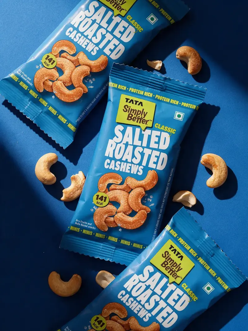
Create an ultra-photorealistic premium snack-product campaign image based closely on the reference composition. Replace every reference pouch with multiple packets of [MY UPLOADED PRODUCT], preserving the original packaging exactly.
Composition
Create an edge-to-edge flat lay with approximately five packets arranged in a flowing diagonal cascade from the upper-left to the lower-right. Let one main packet dominate the centre and remain fully visible. Overlap the other packets naturally above and below it, with some cropped by the top, bottom and side edges. Rotate each packet slightly differently while keeping the front labels facing the camera. Preserve realistic pouch thickness, sealed edges, soft wrinkles and air-filled volume. Scatter fresh and sliced [MAIN INGREDIENT OR FLAVOUR] pieces between the packets. Keep the ingredients secondary to the packaging.
Exact product preservation
Maintain the exact packet shape, size, proportions, logo, product name, flavour name, supporting text, colours, graphics, typography, label placement, certification marks, weight, material finish and sealed edges. All text must remain correctly spelled, upright and readable. Do not redesign, simplify, recolour or invent details.
Background and colour
Use a rich, solid [BACKGROUND COLOUR] selected from or complementary to the product’s dominant brand colour. Create a bold monochromatic campaign look while maintaining clear contrast between the packets and background.
Lighting and camera
Use an exact 90-degree overhead camera angle and sharp focus across the image. Use strong directional sunlight from the upper-left, producing crisp dramatic shadows from the packets and ingredients toward the lower-right. Add realistic highlights and subtle reflections without excessive glare.
Avoid
Incorrect labels, blurred or mirrored text, altered logo, invented information, warped packets, identical duplicated folds, flat packaging, excessive glare, incorrect ingredients, deformed fruit, random props, hands, people, floating objects, extra promotional text, watermark or border.
4. Product Range in Colourful Crate
Recommended aspect ratio: 3:4 vertical
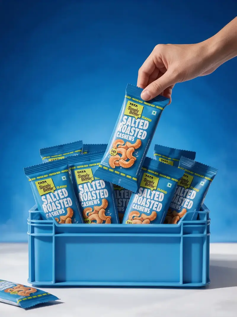
Create an ultra-photorealistic premium FMCG campaign image inspired by the reference. Replace every packet with [MY UPLOADED PRODUCT OR PRODUCT RANGE], preserving the original packaging with absolute accuracy.
Composition
Use a clean front-facing, eye-level camera angle with a subtle downward view into a rectangular plastic storage crate at the centre-bottom of the frame. Fill the crate with approximately 10–12 packets arranged upright in a colourful, abundant display. Keep front packets clearly visible and let rear packets overlap naturally at different heights. If multiple flavours are uploaded, distribute every variant naturally. If only one product is uploaded, repeat it with varied natural angles without inventing new flavours or colours. Let one additional packet sit partially cropped on the floor near the lower-left edge.
Hero hand interaction
A realistic hand enters diagonally from the top-right and gently grips the upper sealed edge of one hero packet. Lift the packet slightly above the others. Keep its front panel facing the camera and do not cover the logo, name or important information.
Crate styling
Use a sturdy crate in a lighter shade of the product’s primary brand colour, with realistic moulded panels, rounded edges, recessed sections and subtle surface texture. Keep the front panel blank unless a separate brand logo is uploaded.
Background and lighting
Create a seamless [BRAND COLOUR] gradient background, transitioning from deeper colour at the top to a lighter atmospheric tone near the horizon. Use a clean matte white floor with a gentle horizon line and realistic contact shadows. Apply bright directional studio lighting from the upper-left, soft front fill and delicate rim highlights around the hand, packets and crate.
Product accuracy
Preserve the exact packet shape, size, proportions, logo, product name, flavour name, original colours, graphics, typography, label placement, weight, certification marks, material texture, gloss level and sealed edges.
Avoid
Reference-brand logos, foreign text outside the packaging, altered product design, invented variants, blurred or mirrored labels, oversized packets, hidden branding, warped crate, distorted hand, extra fingers, duplicate hands, floating packets, excessive smoke, harsh glare, random props, watermark, border or promotional copy.
5. Game Night Product Flat Lay
Recommended aspect ratio: 4:5 vertical
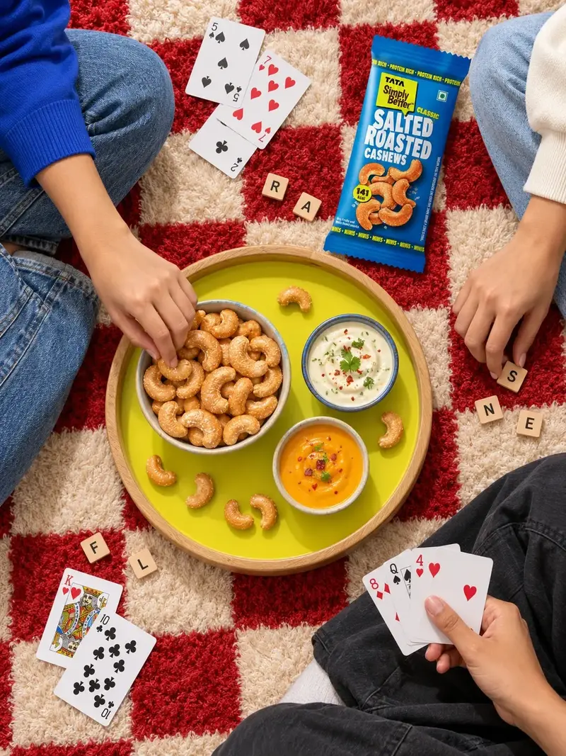
Create an ultra-photorealistic premium lifestyle advertisement based closely on the reference. Replace the reference biscuit packet with [MY UPLOADED PRODUCT] and adapt all visible snack pieces to accurately represent the contents of my product.
Composition and camera
Use an exact 90-degree overhead flat-lay camera angle on a soft, fluffy red-and-cream checkerboard rug. Place a large circular wooden serving tray slightly below the centre. Give it a natural light-wood rim and a bold [CONTRASTING BRAND COLOUR] interior. Arrange three serving bowls on the tray: one filled with [MY PRODUCT OR SNACK], one creamy dip appropriate for it, and one complementary dip or appetiser. Scatter a few individual snack pieces naturally on the tray, matching the real product’s shape, texture, seasoning and colour.
People and activity
Show three friends around the tray, revealing only cropped legs, arms and hands.
Place one person along the left edge wearing jeans and a brand-colour top, another along the right edge in light-blue jeans, and a hand entering from the lower-right holding playing cards. Scatter additional cards and small letter tiles casually around the tray. Keep all hands anatomically correct with authentic skin texture.
Product placement
Place [MY UPLOADED PRODUCT] on the rug in the upper-right, angled slightly toward the tray. Keep the complete front facing the camera, unobstructed, sharp and readable. Make the packet noticeable but realistically sized. Preserve its exact shape, proportions, logo, product name, flavour name, colours, graphics, typography, label placement, weight, certification marks, material texture, seams and finish.
Styling and lighting
Use a bold palette derived from the product packaging. Coordinate clothing, bowls and props with the brand colours. Use bright direct editorial lighting from the upper-left, creating crisp natural shadows beneath the tray, bowls, cards, hands and product.
Avoid
Headline, tagline, price, Buy Now text, logos outside the original packaging, measurement graphics, foreign branding, watermark, altered branding, incorrect snacks, plastic-looking food, oversized packet, covered label, extra hands or fingers, deformed cards, floating objects, clutter, harsh glare or artificial rug texture.
6. Excited Living Room Watch Party
Recommended aspect ratio: 3:4 vertical
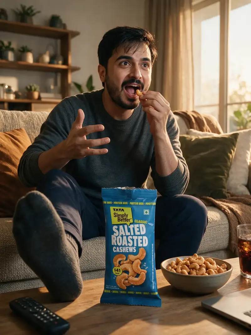
Create an ultra-photorealistic, energetic lifestyle advertisement inspired by the reference. Replace the original person with [MY UPLOADED MODEL] and replace all branded packaging and snack items with [MY UPLOADED PRODUCT].
Model identity and expression
Preserve the model’s facial structure, skin tone, eyes, nose, lips, jawline, hairstyle and natural body proportions. Maintain visible pores, fine facial hairs, subtle marks and natural tonal variation. Give the model a believable expression of excitement: wide eyes focused on an off-camera television, open mouth, raised eyebrows, one expressive hand and the other holding a real snack piece near the mouth. The model does not look at the camera.
Composition and pose
Use a dynamic, slightly low, front-facing wide-angle camera at coffee-table height. Seat the model in the centre of a sofa, leaning forward. Extend one sock-covered foot toward the camera in the left foreground and keep the other leg naturally bent. Keep the anatomy believable and prevent the foreground foot from covering the face or product.
Product placement
Place [MY UPLOADED PRODUCT] upright in the central foreground on the coffee table between camera and model. Keep it readable and prominent without making it unnaturally oversized. If it is a packet, open it naturally at the top. If it is a box, jar, tub or other container, preserve its real opening mechanism. Place a serving tray or bowl beside it containing the actual snack, plus [APPROPRIATE DIP OR ACCOMPANIMENT] only when relevant.
Environment and props
Create a warm contemporary living room with a sofa, textured cushions, casually draped blanket, shelves, plants and softly blurred décor. Add a television remote at lower-left, a partially visible laptop or tablet at lower-right, and a transparent glass of cold dark beverage with a subtle realistic splash. Keep all props secondary.
Lighting and colour
Use rich amber-orange cinematic lighting motivated by late-afternoon sunlight through curtains, soft television light on the face and gentle rim light around the hair. Match accent colours to the product packaging. Keep the product and face sharp while softly blurring the background.
Avoid
Headline, slogan, price, logos outside the packaging, watermark, altered face, wrong expression, looking at camera, covered label, incorrect snack, deformed hands, extra fingers or limbs, distorted foot, floating food, excessive liquid splash, unreadable packaging, mirrored text, artificial skin, excessive orange tint, clutter or reference-brand elements.
7. Hands Reaching for Hero Product
Recommended aspect ratio: 4:5 vertical
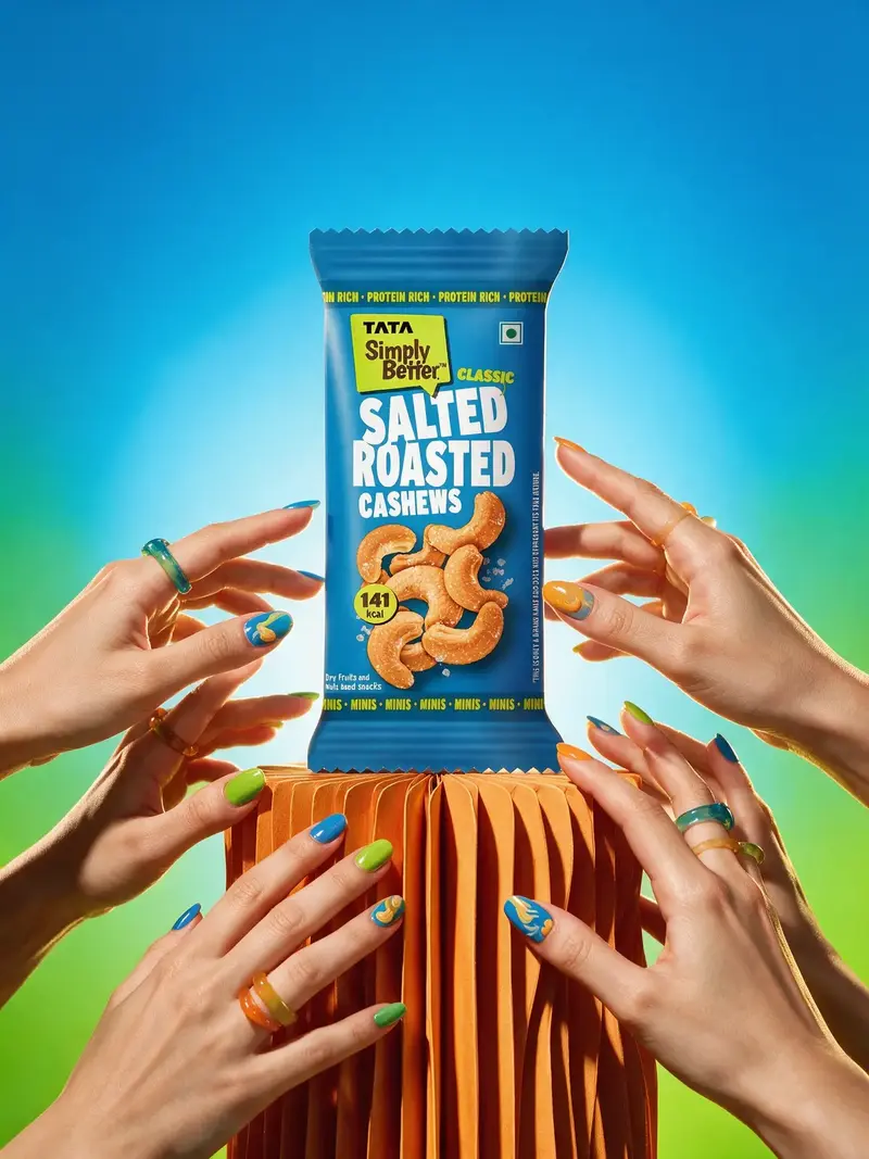
Create an ultra-photorealistic, vibrant Gen-Z product advertisement based closely on the reference. Replace the original beverage can with [MY UPLOADED PRODUCT] while preserving the dramatic lighting, colourful hand arrangement, pedestal placement and bold studio aesthetic.
Hero product
Position [MY PRODUCT] upright in the exact centre on a tall sculptural pedestal with vertically folded or fluted sides. Keep the front label facing the camera, perfectly sharp, unobstructed and readable. Preserve the exact packaging shape, proportions, cap or lid, seal, logo, product name, flavour name, colours, illustrations, typography, label placement, visible details, material finish and surface texture. Add fine condensation only when the product is a cold beverage. Otherwise preserve its authentic dry, glossy, matte, glass or plastic finish.
Hands and styling
Surround the product with approximately six to eight feminine hands reaching inward from the lower-left, lower-right and side edges. Arrange the hands at different heights and depths without covering the logo or important label information. Use colourful glossy nail art inspired by the packaging, minimal translucent resin rings, natural skin tones, pores, fine hairs, creases and realistic knuckles. Every hand belongs to a believable off-frame person and has exactly five fingers.
Background and pedestal
Use a bold seamless gradient derived from the product’s dominant colour. Create a bright halo behind the product, fading into a deeper complementary shade at the edges. Match the pedestal to a contrasting secondary packaging colour and give it a matte finish with realistic folds, highlights and shadows. Keep clean negative space across the upper third for optional future copy.
Lighting and camera
Use straight-on, eye-level commercial photography with subtle low-angle emphasis and a 70–85mm lens
perspective. Apply intense direct light from the front-left and a warm backlight. Create crisp coloured shadows from the hands and controlled reflections on the packaging. Keep the product as the sharpest and brightest element.
Avoid
Headline, slogan, price, logos outside the packaging, watermark, border, hands covering the label, extra fingers, fused hands, duplicated poses, distorted nails, oversized product, warped packaging, blurred or mirrored text, altered branding, excessive condensation, floating product, flat lighting, plastic skin or random props.
8. Tote Bag On the Go Product Shot
Recommended aspect ratio: 4:5 vertical
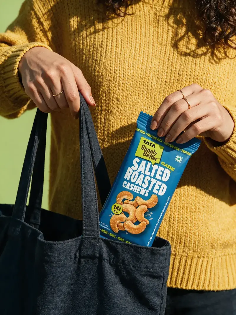
Create an ultra-photorealistic outdoor lifestyle product photograph based closely on the reference. Replace the original bottle with [MY UPLOADED PRODUCT] while preserving the close-up composition, saturated styling, hand pose, tote bag and strong natural sunlight.
Composition
Use a tightly cropped chest-to-hip portrait, excluding most or all of the model’s face. Allow only part of curly hair to enter from the upper-right edge. Dress the model in a vibrant textured knitted sweater in [COLOUR COMPLEMENTARY TO MY PRODUCT]. Let a dark canvas tote bag hang from the left hand and fill much of the lower-left frame. Capture the right hand pulling [MY PRODUCT] out of the tote. Keep part of the product inside the bag while the upper two-thirds remain visible. Position the product near the lower-centre or right area with its front label facing the camera.
Hand placement
Grip the product naturally around its upper side, shoulder, neck or sealed edge according to the real
packaging format. Keep fingers away from the logo and product name. Use realistic finger length, joints, nails, skin creases, simple metallic rings and muted nail polish coordinated with the brand palette. Let the left hand grip both tote straps with realistic fabric tension and folds.
Exact product preservation
Preserve the exact container or packet shape, proportions, cap, lid, pump, seal, opening mechanism, logo, product name, variant, colours, graphics, typography, label dimensions and placement, visible contents, material finish, reflections and transparency. All text must remain correctly spelled, upright, sharp and readable.
Styling and background
Use tonal colour blocking inspired by the packaging. Coordinate the sweater, tote, nail polish and jewellery without making every element the same shade. Use a softly blurred, minimal background in a lighter complementary brand colour.
Lighting and texture
Use strong direct late-morning sunlight from the upper-left, creating crisp graphic shadows of fingers, product and tote straps across the sweater and bag. Retain visible knitted fibres, ribbed cuffs, natural canvas texture, stitched seams, controlled product highlights and realistic contact shadows where the product enters the bag.
Avoid
Headline, slogan, price, extra logo, watermark, border, text outside the packaging, covered label, oversized product, incorrect packaging, mirrored text, distorted hands, extra fingers, fused straps, floating product, artificial skin, plasticky fabric, excessive glare, fake condensation, visible full face or unnecessary background objects.
How to get cleaner packaging results
Start with the highest-resolution front-facing product photograph you have. If the model changes the label, repeat the complete product-accuracy paragraph at both the beginning and end of the prompt. Generate again instead of trying to repair heavily distorted text. A clean source image, a clearly visible front label and realistic product scale usually make the biggest difference.
Final checklist before using an AI product visual
- The logo, product name, flavour and weight are correct and readable.
- The packaging shape, material, seal, cap or opening mechanism matches the real product.
- The product is realistically sized for the hand, table or environment.
- Hands have believable anatomy and do not cover essential branding.
- Food pieces match the actual snack, ingredient or flavour.
- There is no invented advertising copy, watermark or extra logo.
Questions, answered.
Can I use these prompts with any AI image generator?
Yes. Adapt the wording and reference-image controls to the model you use.
Do I need to upload my product image?
Yes. A clear front-facing product image gives the model the packaging information it needs to preserve.
How do I stop AI from changing my packaging?
Keep the complete product-accuracy paragraph, use a sharp reference and regenerate any result with incorrect text.
Can I replace the person in the lifestyle prompts?
Yes. Upload your model reference with the product and keep the identity-preservation instructions.
Which image size should I generate for social media?
Use 4:5 for feed posts, 9:16 for Stories and Reels covers, and 3:4 for flexible editorial layouts.
Found your next idea?
Explore prompt packs